Most QR code failures on wedding stationery come down to seven or eight specific, repeatable errors. Every one of them is caught by a test print. Almost nobody does a test print.
Here's the list, roughly in order of how often it wrecks things.
1. Printing it too small
The most common one. A code that looks fine at 0.4 inches on a screen becomes an unreadable smudge on paper, because the individual squares fall below what a phone camera can resolve at arm's length.
Fix: minimum 0.8 inches / 2 cm square on stationery. One inch is safer. On signage, 4 inches or more. If the layout doesn't have room, move the code to an insert or the back of the card rather than shrinking it.
2. Cropping the quiet zone
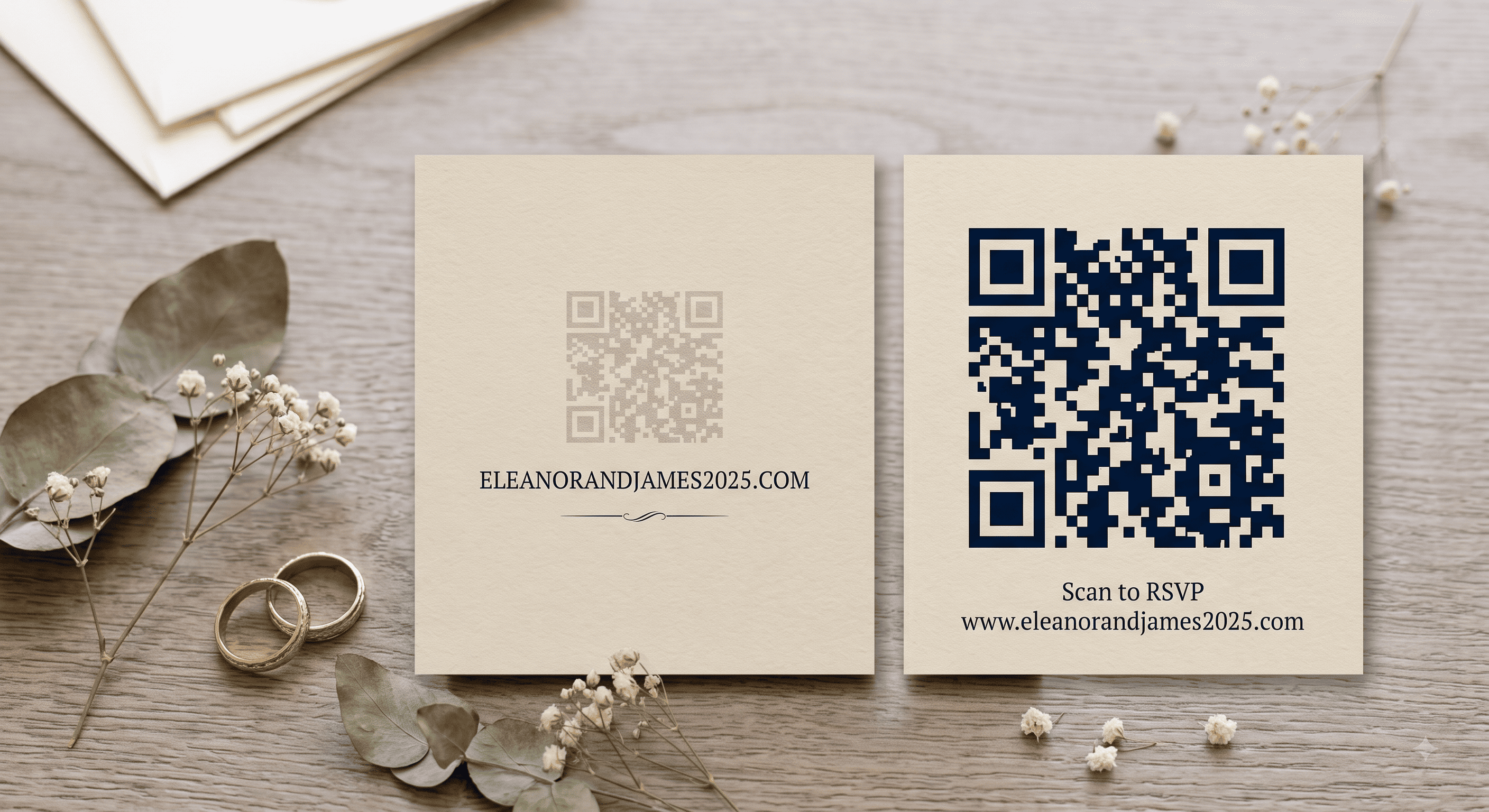
QR codes need clear margin on all four sides — roughly the width of four of the pattern's small squares. Scanners use that blank space to find the edges of the code. Designers, working to a tight layout, crop it or run a border right up against it, and the code stops working for reasons nobody can see.
Fix: if the code looks snug against anything, it's too snug. Give it a visible frame of empty space.
3. Putting it on foil, gloss, or a photo
Metallic ink, spot foil, and glossy varnish all reflect light directly back at the camera. Under a bright kitchen bulb or a phone's own flash, the code disappears into glare. Photo backgrounds cause a related problem: not enough contrast between pattern and background.
Fix: matte finish over the code area, always. On photo save the dates, put the code on the reverse or on a solid block of white. If your card is gloss overall, ask your printer about spot-matte.
4. Low contrast or inverted colors
Blush on ivory. Sage on cream. Beautiful, unscannable. And light-on-dark inverted codes fail on a meaningful share of older phones, because many scanners expect dark modules on a light field.
Fix: dark pattern, light background, high contrast. Navy, charcoal, forest, burgundy on white or cream all work. Test any color pairing you're unsure about before the full run.
5. Using a dynamic code that expires
A large share of free generators produce dynamic codes — the URL routes through their servers — with a trial period. When the trial lapses, the redirect dies and every printed invitation points at a "this link has expired" page. The couple finds out when a guest texts them.
Fix: use a static code. If a generator asks you to make an account before giving you the file, assume it's dynamic and read the terms. Static codes are free and never expire.
6. Pointing it at a URL you don't control
Same failure, different cause. Free page builders shut down, subdomains get reassigned, and platform URLs change format. Your printed cards can't follow.
Fix: buy the domain. It's $15–20 a year and it makes the address permanently yours. Point the code there and change the content behind it as often as you like.
7. No label and no printed URL
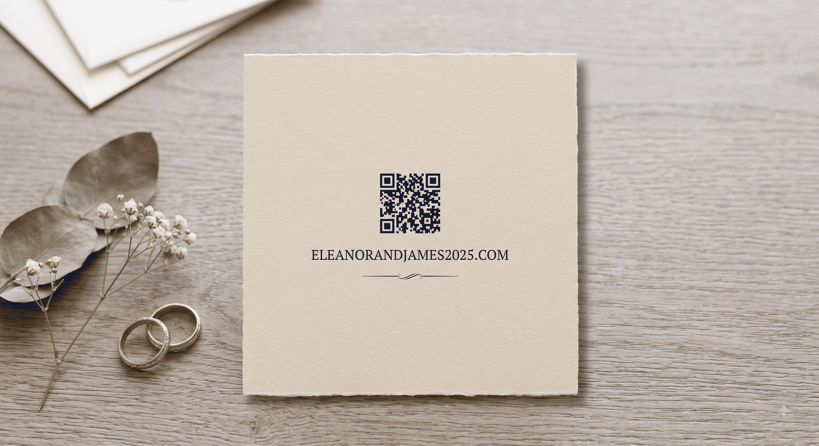
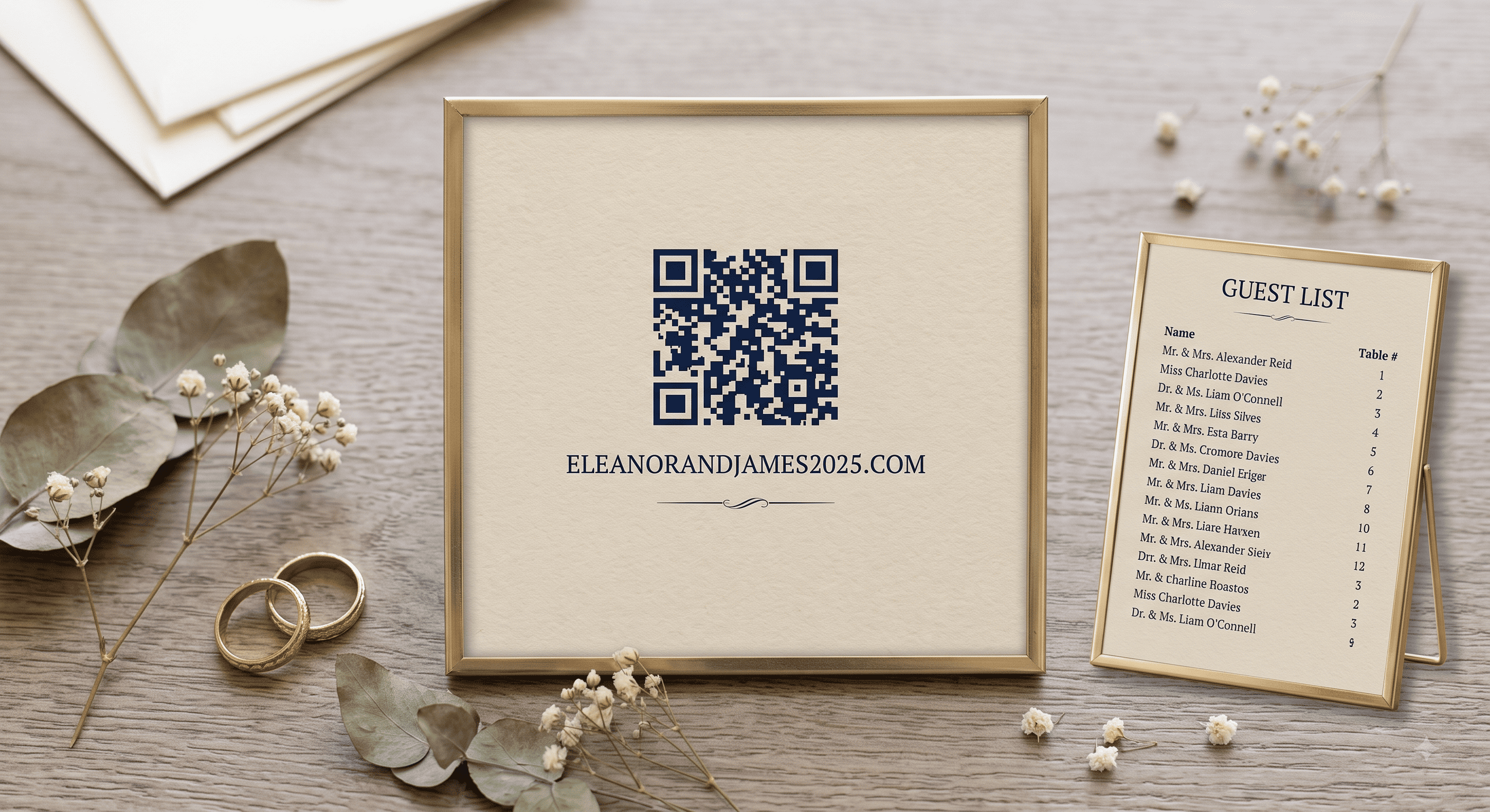
A bare square next to elegant script tells a guest nothing about what it does. And with no fallback address, anyone whose camera won't cooperate — or who received a photographed copy of the card — has no route at all.
Fix: two lines beside the code. A label ("Scan for details and to RSVP") and the plain URL in small type. This is the cheapest insurance on the whole card.
8. Testing on a screen instead of on paper
Screens are backlit, perfectly flat, and high contrast. They scan almost anything. Paper under a hallway light does not. A code that works on your laptop can fail completely on textured cotton stock.
Fix: print one proof at final size on the actual stock, and scan it with an iPhone, an Android, and a phone that's four or five years old — in poor light, and at an angle.
9. Linking to a PDF or something behind a login
A letter-size PDF on a 6-inch screen means pinching and dragging. A login wall means most guests leave. Both convert a two-second action into a chore.
Fix: link to a mobile web page. If you're sharing a photo album, open the permissions and test the link while logged out of your own account.
10. More than one code on the same card
Two codes — one for RSVP, one for directions — creates a decision where you wanted an action. Guests scan the wrong one or neither.
Fix: one code per card, pointing at that card's primary job. Put everything else on the page it lands on.
The quick pre-print checklist
| Check | Pass condition |
|---|---|
| Size | ≥ 0.8 in / 2 cm on stationery, ≥ 4 in on signage |
| Quiet zone | Clear margin on all four sides |
| Contrast | Dark code, light background, not inverted |
| Finish | Matte over the code area |
| Code type | Static, not a trial dynamic code |
| Destination | A domain you own, mobile-friendly, live now |
| Label | One line of text explaining what it does |
| Fallback | Plain URL printed beneath |
| Test | Proof on real stock, three phones, dim light |
| Count | Exactly one code on this card |
Run that list once and you've eliminated essentially every failure mode above.
Last word
Every mistake on this list is caught by the same five-minute habit: print it, hand it to someone who's never seen it, and stay quiet. If they scan it without asking a question, mail the invitations.
Related: QR code wedding invitations: the complete guide · How to make a QR code for a wedding invitation · QR codes on save the dates
People Also Asked
Explore common questions related to this blog.