No. But there's a version of digital that is tacky, and if you've been arguing about this with your mother for two weeks, she's probably picturing that version and you're picturing a different one.
The tacky thing was never the delivery method. It's a handful of specific, avoidable mistakes that make an invitation feel like a group text about a birthday at Applebee's. Fix those, and nobody notices — or cares — that it arrived on a screen.
Where the "tacky" reputation actually came from
Early e-invites looked bad. That's the whole origin story. 2008-era Evite was gaudy borders, animated GIFs, a visible list of every other guest, and a giant ad for a pizza chain under the RSVP button. An entire generation of parents formed their opinion there and never updated it.
Meanwhile, wedding stationery carried real social weight. Engraved paper signalled that money and thought were spent. A free e-card signalled the opposite. That association is fading fast, but it hasn't fully died in every family, which is why this question still gets asked a hundred times a month.
The design gap has closed, though. A well-built digital invitation in 2026 looks better on a phone than a printed card photographed badly and sent as a blurry WhatsApp forward — and that's what most "paper" invitations end up as anyway, once guests photograph them to remember the address.
The five things that genuinely read as tacky
None of these are "you sent it digitally."
1. Sending it to a group thread. Twenty-six people in one chat, everyone's numbers exposed, someone's uncle replying "who dis." This is the single biggest offender. One link per household, sent individually. Always.
2. No wording, just an image. A pretty graphic with a date and no host line, no "request the pleasure of your company," no context. It reads as an ad. Invitation wording exists because it does a job — it tells guests who's hosting and how formal the day is.
3. A platform watermark. Free tiers that stamp "Made with FreeInviteMaker" across the bottom of your wedding invitation. Guests notice. Pay the $12 or use a tool without the branding.
4. Details that keep changing. Sending an invite, then three correction texts. This makes the whole thing feel improvised, and it's the fastest way to lose a guest's confidence in your planning.
5. RSVP by "just let me know." No deadline, no mechanism, no way to reply. That's not an invitation, it's a vibe. Then you're chasing 40 people in September.
Notice that a printed invitation can commit four of those five. Tackiness is a craft problem.
The one factor that actually predicts backlash
It's not formality. It's the age curve of your guest list.
Run a rough count. What percentage of your guests are over 65?
| Guests over 65 | What to expect | What to do |
|---|---|---|
| Under 10% | Nobody will comment. Send digital to everyone. | Nothing special |
| 10–25% | One or two remarks, no real friction | Print 10–20 cards for that group |
| Over 25% | Genuine confusion and hurt feelings if digital-only | Hybrid, and treat paper as the default for the older tier |
That's the whole calculation. A 28-year-old couple with a friend-heavy list can go fully digital and nothing happens. A couple marrying into two large extended families with a lot of great-aunts should not, and the workaround is small: a short print run for the guests who expect one costs less than your florist's delivery fee.
The formality of the wedding matters less than people insist. What matters is whether the invitation looks like it was made rather than dashed off — a point Emily Post's guidance on matching invitation style to the event has made for decades, and it applies identically to pixels.
Make a digital invite look expensive (it's four things)
- One typeface family, two weights. Mixing three fonts is what makes homemade invitations look homemade. A serif for names, a clean sans for details. Done.
- Real invitation wording. Host line, request line, names, date, place, reception line, RSVP. Even a casual wedding benefits from the structure. If you're stuck on phrasing, we have full wording sets in the guide to who's hosting and how that changes the first line.
- Space. Cramming eight details onto one screen is the tell. Push the extras to a second screen or the wedding website.
- One accent colour, not four. Gold text on cream will always outperform a gradient.
If you'd rather not build the layout yourself, template galleries handle the typography decisions for you — Eventic's wedding invitation templates are designed at phone dimensions rather than shrunk from a paper size, which is the difference between "reads beautifully at arm's length" and "pinch to zoom." Minted and Canva both work too if you want to start from a paper layout and adapt.
The conversation with your mother
She's not actually arguing about paper. She's arguing about whether the wedding will feel serious, and whether her friends will judge her. Two moves that end the argument fast:
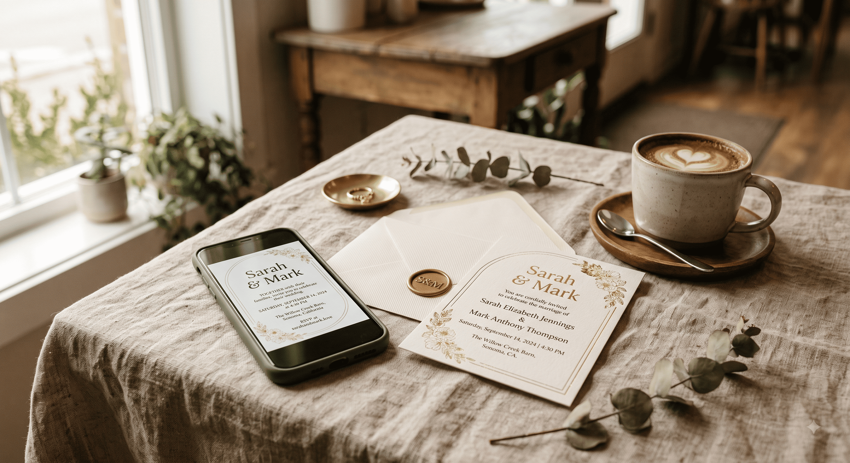
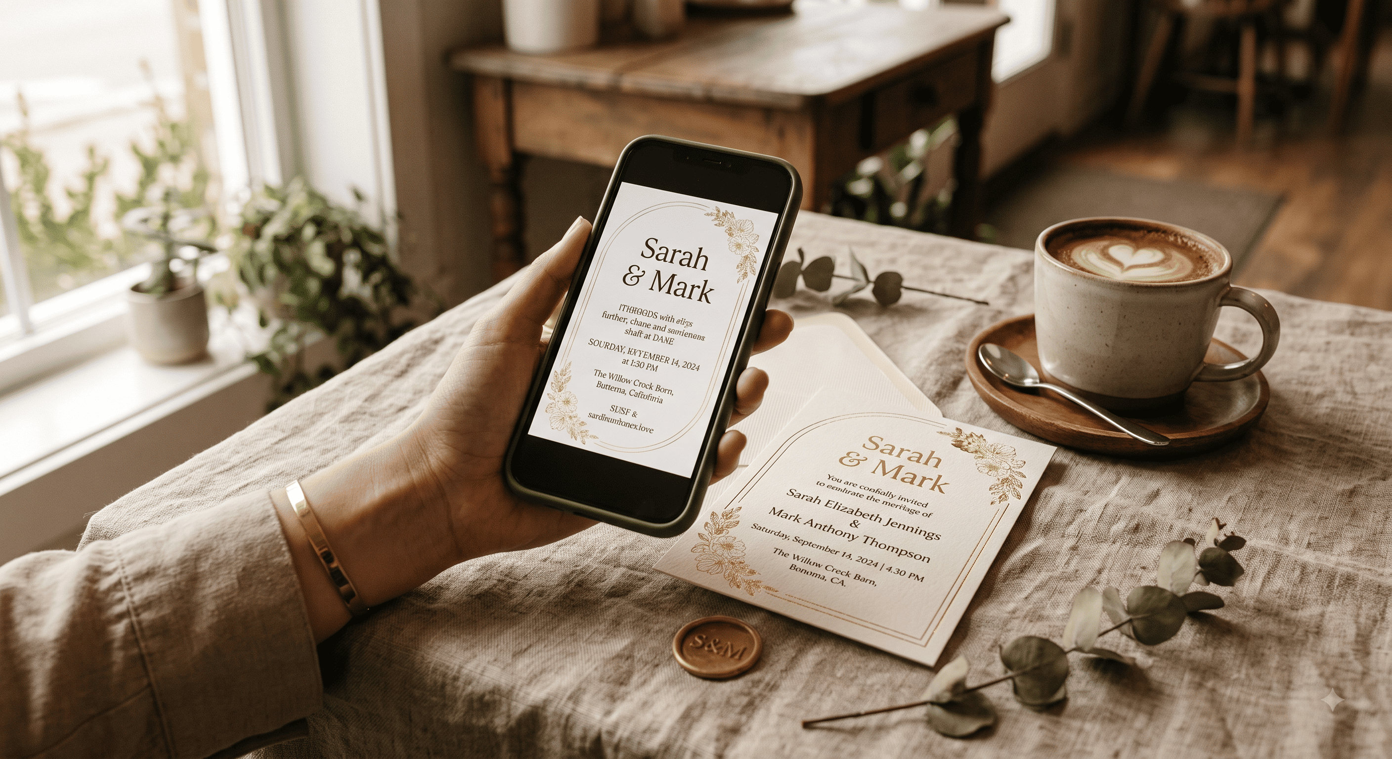
Show her the invitation on a phone before you send it. Not a description — the actual thing. Most objections evaporate in the four seconds it takes to see that it looks good.
Then offer her a stack of printed cards for the people she wants to hand-deliver to. Twenty-five cards, her list, her control. She gets the ritual, you get to skip 150 envelopes, and everyone's happy. Plain heavyweight cardstock and a printer service will do this for well under $60 — a wax seal kit on those few cards is a genuinely disproportionate upgrade for the money if she's hand-delivering them anyway.
Heads up: some links in this post are Amazon affiliate links — if you buy through them, Eventic earns a small commission at no extra cost to you.
People Also Asked
Explore common questions related to this blog.